INRIX: Congestion in SA slightly worse

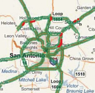
Top 10 SA-area bottlenecks (in red)
Traffic data services company INRIX’s annual “National Traffic Scorecard” was released a few weeks ago, and it shows that traffic congestion in San Antonio increased slightly over the past year.
This year, San Antonio ranked 25th in the nation in terms of overall traffic congestion. After flip-flopping with Houston last year, the Dallas-Ft. Worth area regained the title as Texas’ most congested region, landing at the number five spot nationally. Houston was sixth, and Austin was 23rd. The Los Angeles area was tops.
In a separate measurement of congestion called the “Travel Time Tax” (T3), Austin was the only Texas city in the top 10, ranking fifth with a T3 of 20.7%. The T3 measurement calculates how much longer a journey will take during the peak period than it does during off-peak times, so peak period trips in Austin take an average of 20.7% longer than non-peak trips. San Antonio ranked 37th in that regard, with a T3 of just 6%, unchanged over last year. So, for a commuter with a journey that is 30 minutes in non-congested conditions, that translates to an extra 14.6 hours per year stuck in traffic.
Bottlenecks
The study also looks at individual bottleneck locations in each region. To do so, the authors look at 48,000 discrete road segments nationally, most corresponding to an interchange and its approaches in both directions. Not surprisingly, the vast majority of the top 100 bottlenecks nationally– and over half of the top 1,000– were in the New York, Los Angeles, and Chicago areas. Only one location in Texas made it to the top 100: I-35 northbound at Riverside Dr. in Austin, which placed 76th with 48 hours a week of congestion and an average speed of 17 mph. DFW had 4% of the top 1,000 bottlenecks nationally; Houston 3%.
The top bottleneck in the DFW area was on Loop 820 westbound at Rufe Snow Dr. on the northeastern side of Ft. Worth (#148 nationally). Interestingly, four of the top five spots in the DFW area were in the Ft. Worth side of the Metroplex, not Dallas. In Houston, the top bottleneck was Loop 610 northbound at Westheimer near the Galleria (#271). All of the top 10 locations in Austin were, not surprisingly, on I-35.
In San Antonio, the top bottleneck continues to be Loop 410 northbound just before I-35 on the East Side. It ranked 477th nationally, with the worst time on Fridays from 4-5pm where traffic crawled at an average speed of just 7 mph. That was followed in order by the following spots:
- Loop 1604 EB at Lockhill-Selma (1381)
- I-35 NB at Rittiman (1513)
- US 281 NB at 1604 (1559)
- I-35 SB at Schertz Pkwy (1751)
- I-35 NB at Loop 410 East (1967)
- Loop 1604 EB at Kyle Seale Pkwy (2011)
- Loop 410 EB at I-35 (2048)
- I-35 SB at Evans (2056)
- Loop 410 EB at Austin Hwy (2329)
The worst hour for congestion in San Antonio was Friday afternoons from 5 to 6, with a T3 of 16%. Peak periods overall locally were 6-9am Monday through Friday, 3-6pm Monday through Thursday, and 2-7pm on Fridays. The congestion balance between peak and non-peak periods here was the same as the national average.

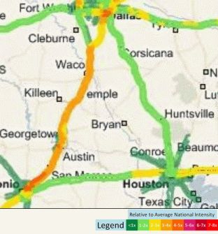
Map showing the freight "intensity" within the Texas Triangle
Freight traffic
Finally, the study also analyzed freight traffic patterns. Nationally, nearly all of the top 50 road segments for freight volumes were in Southern California or on the south side of Chicago. However, of the nation’s top 1,000 miles of busiest freight corridors, 71.6 miles were on I-35 in Texas, namely the San Antonio-Austin corridor. Also in Texas, 8.6 miles were on I-20, and a speck (0.2 miles) was on I-30, both of those in the DFW area.
When ranking freight activity per mile compared to the national average, Austin ranked at the top nationally, with DFW at sixth, San Antonio at 10th, and El Paso at 12th; Houston was a distant 29th. When ranking overall freight activity by metro area, Los Angeles was first, DFW second, Houston eighth, San Antonio ninth, and Austin a little further back at 15th. Not surprisingly, the entire I-35 corridor from Loop 410 East in San Antonio to the I-35 E/W split in Hillsboro showed 3-5 times the national average in freight “intensity”.
To gather the data for the report, INRIX uses a combination of traditional traffic sensors and reports from over 1.6 million GPS “probe” vehicles, typically taxis, delivery vehicles, and trucks. You can view the full report at http://scorecard.inrix.com/scorecard/.